
The Section Block is a free block from the Olympus Blocks plugin.
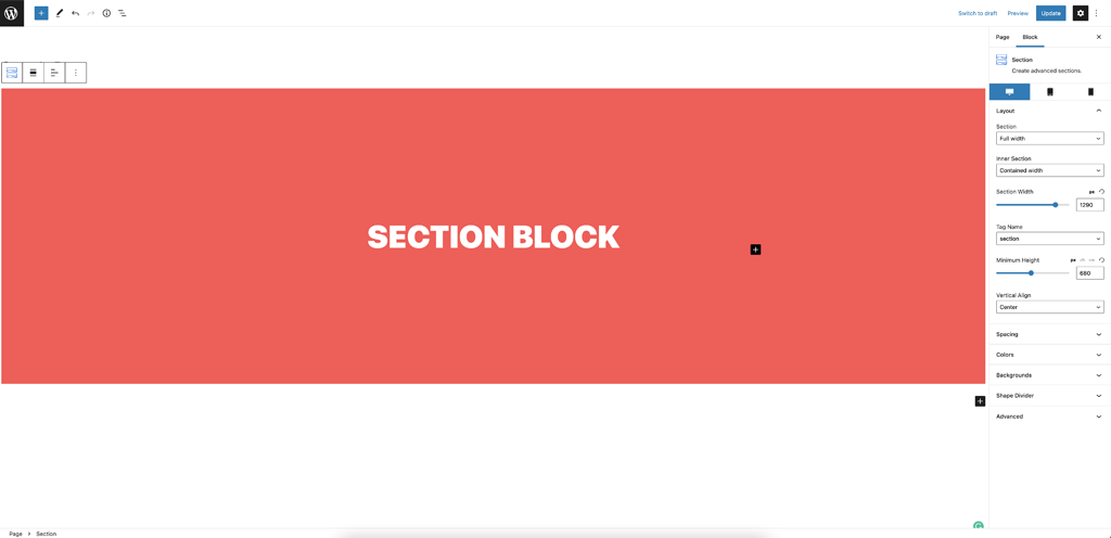
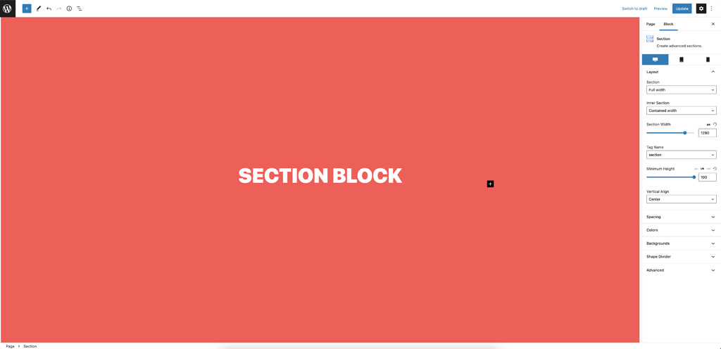
Layout panel
This block allows you to create beautiful contained sections, you can change the width, height, margin, padding, add a background, a shape divider, change the tag to add a div, header, footer, article, main, etc… It works perfectly with the Hooks module from Olympus Pro.
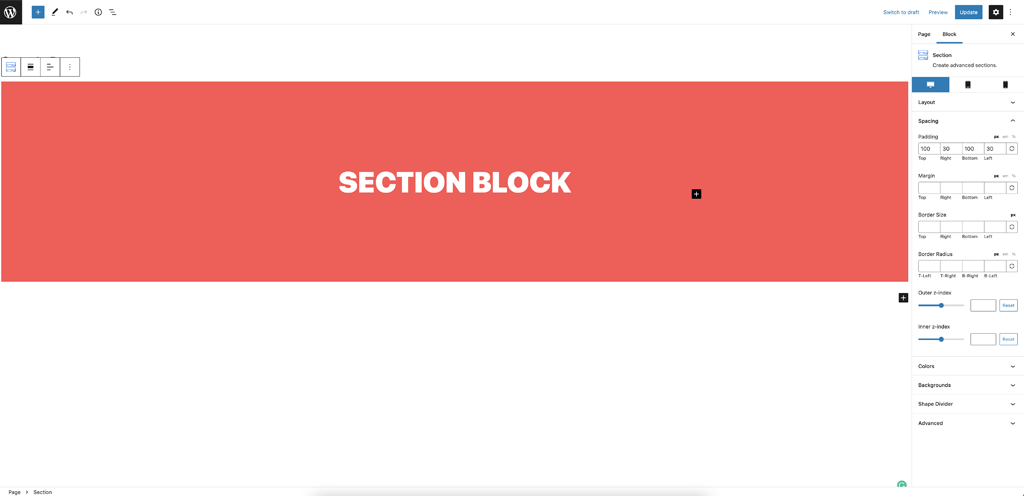
Spacing panel
You can fully control your section padding, margin, border, add a border radius and control the z-index.
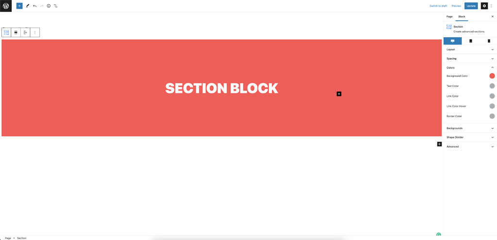
Colors panel
From this panel, you can change your section background, text color, links colors and border color.
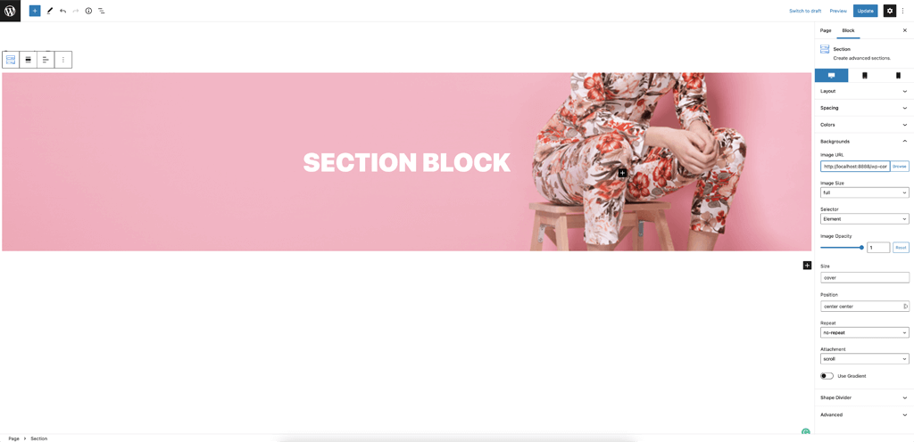
Backgrounds panel
You can add a background image, control the size, the position, fix the background to make like a parallax section, and add a gradient.
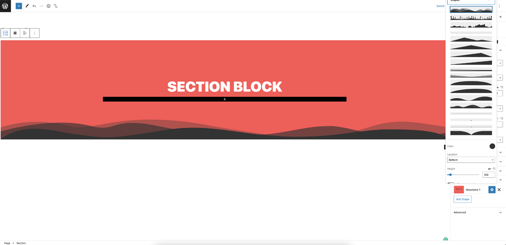
Shape Divider panel
Shapes dividers are great to separate sections with style, just click the Shape Divider panel and click the button to add a shape divider. From here, you can choose between many shapes, add it to the top or bottom, change the color, etc…
Advanced panel
This panel is on all blocks, it is to add custom classes or an anchor.
How to create a full-screen section?
If you want to create a full-screen section for a hero header, for example, it is very easy to do, on the Minimum Height setting, select the vh unit and add 100 in the range control input.
Responsiveness
The Section block is fully responsive so you change the height, width and spacing on tablet and mobile.